Helping a plant-based brand find its flavor on shelf
Created by artist and chef Madelyn Hadley, the Madly Hadley portfolio of recipe enhancers was full of soul and culinary substance, but on shelf, it wasn’t stopping enough shoppers in their tracks. While the packaging was beautiful, it lacked the immediate clarity that busy meal-preppers need. And for a startup looking to scale, standout is key.
We were tasked with refreshing the brand identity and building stronger shoppability by putting product clarity first – without losing the brand’s whimsical spirit.
Our Approach
We started with a simple principle: When it comes to on-shelf cut-through for a brand still building its equity, product trumps brand.
We restructured the packaging communication hierarchy to ensure function and flavor came first. That meant creating a bold visual system that clearly told shoppers what the product was, how to use it, and why they needed it in their kitchen – while still weaving in the brand’s personality.
Concept-to-Commerce™ (C2C) Methodology
As part of our C2C investment program, we partnered with Madly Hadley not just as creatives, but as believers. We knew our methodology, which fuses creativity with commercial smarts from day one, could help this brand thrive.
We immersed ourselves in Madelyn’s creative world, exploring artistic references, understanding her inspirations, and identifying what made the brand’s voice so unique. At the same time, we conducted a full shelf impact analysis, mapping the moves of category leaders and identifying whitespace opportunities.
With insights in hand, we developed 15 creative concepts, each one pressure-tested against shelf sets to ensure it didn’t just look great on its own but stood out in context.
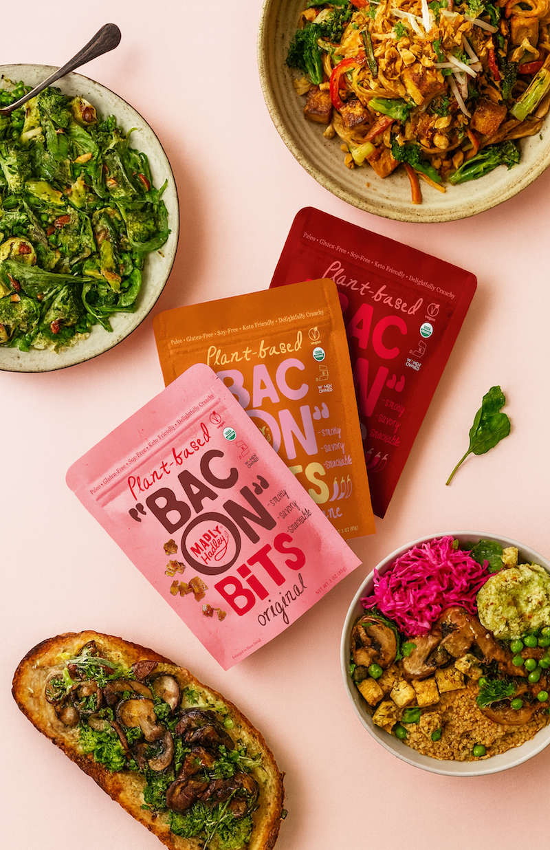
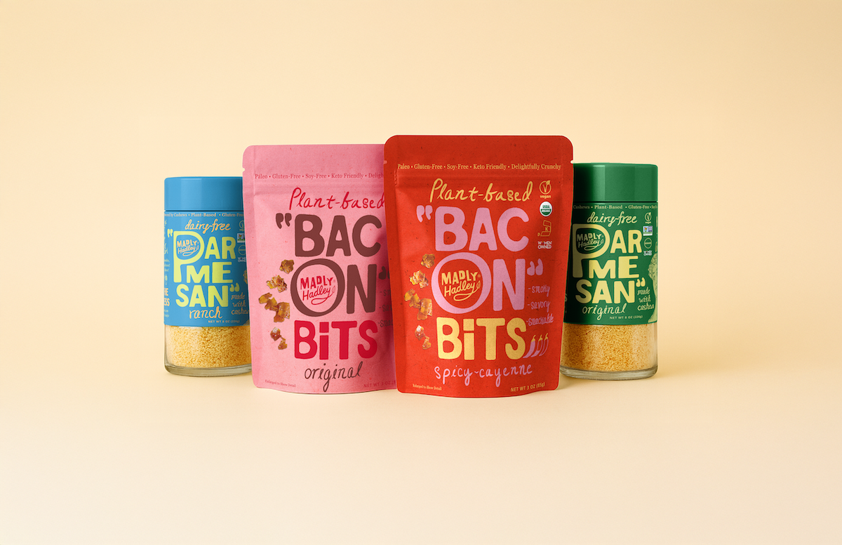
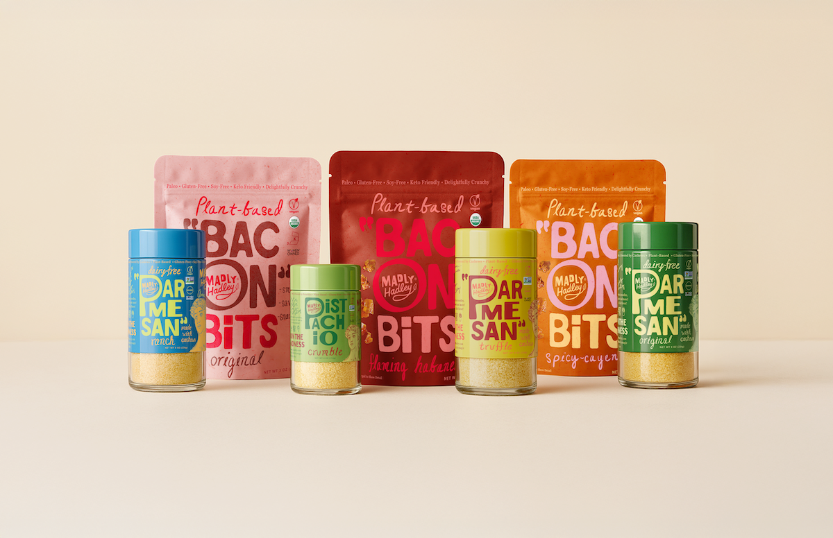
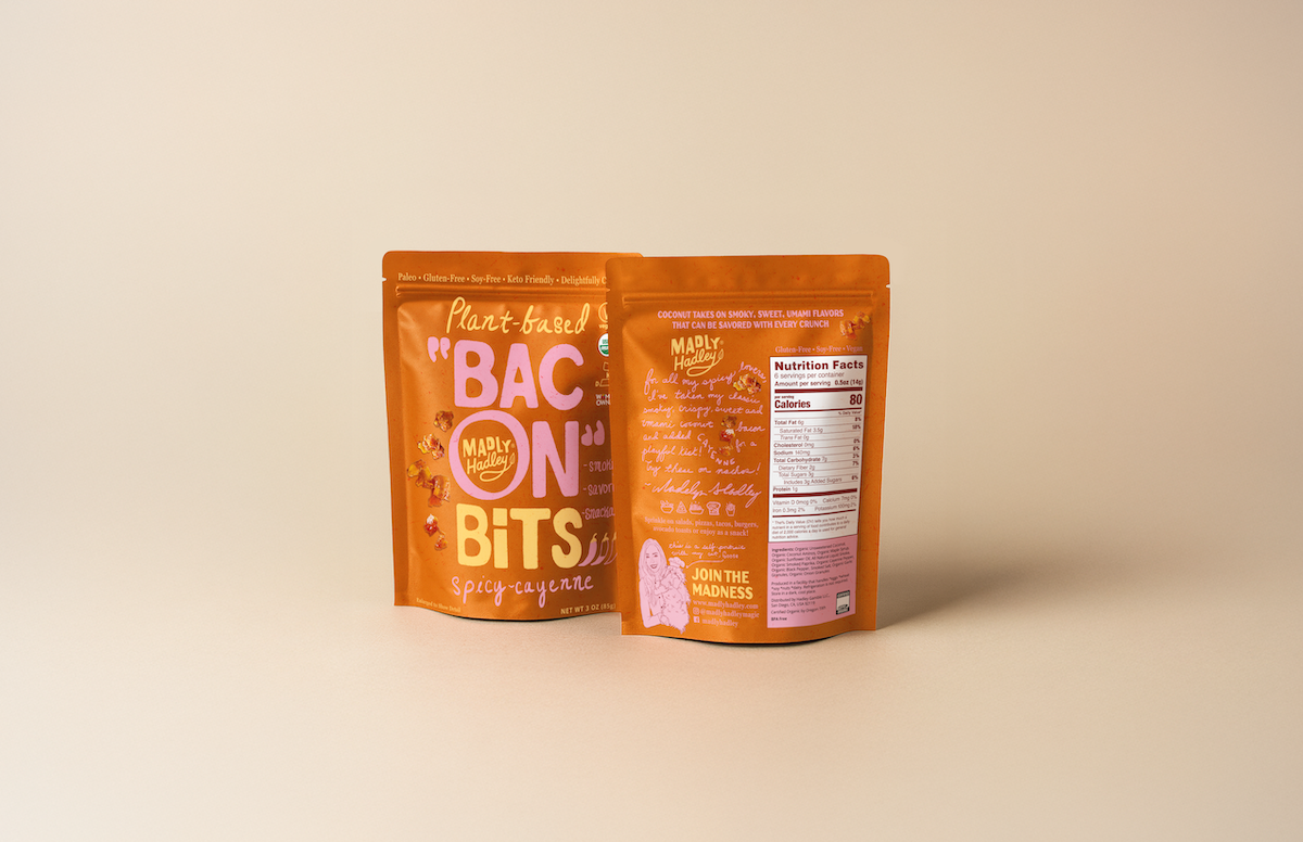
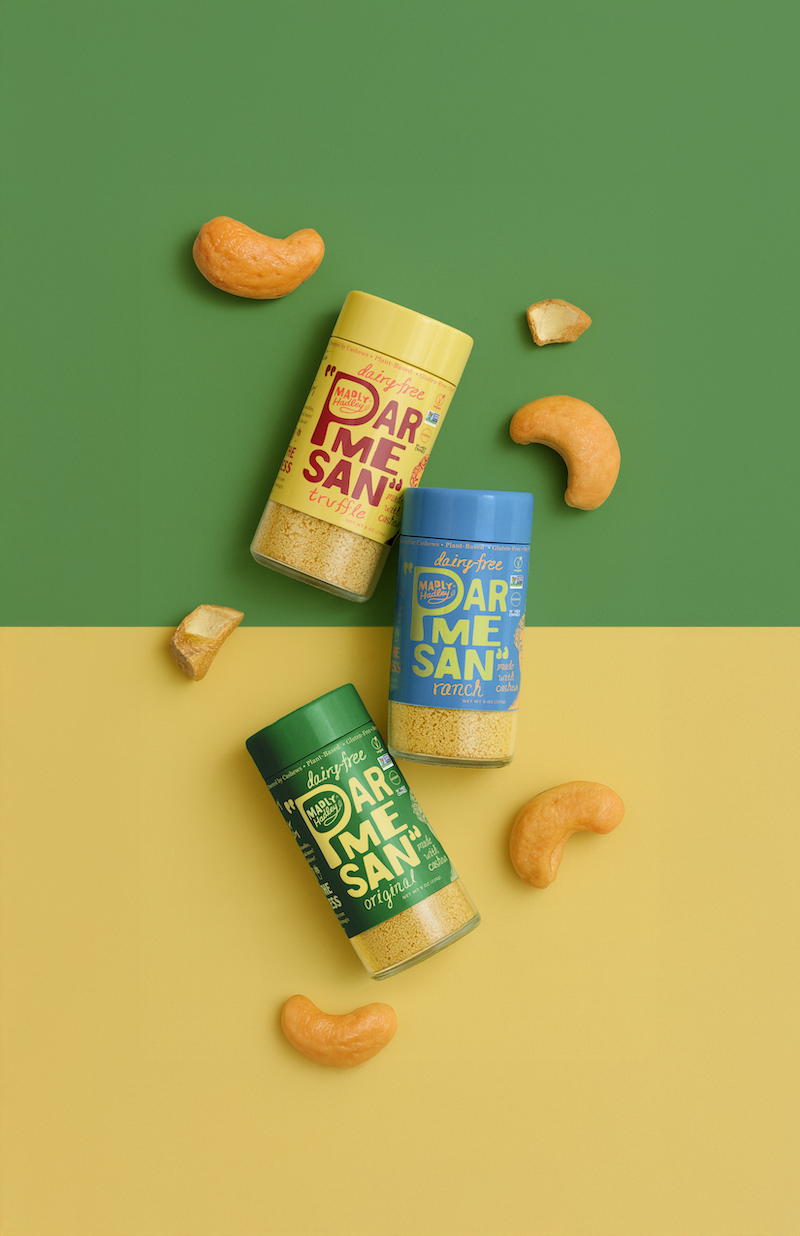
The winning concept is a typography-led design with vibrant colors and strategically placed quotation marks – a wink to the plant-based nature of the product. It’s ownable, extendable, and unapologetically bold.
We landed on a packaging system designed to scale, built around:
- Clear, product-first typography
- Quotation marks for subtle plant-based cues
- Vibrant color coding to differentiate flavor
- A simplified messaging hierarchy
- Graphic elements with real portfolio stretch
- A visual language that nods to the brand’s magic
The result is a shelf-smart transformation that brought more flavor, more clarity, and more charm – prepping Madly Hadley for national expansion, new SKUs, and an even bigger fanbase.
Services Utilized
- Marketplace Audits + Brand Strategy
- Portfolio Strategy + Architecture
- Graphic Packaging Design
Bringing home the “bacon”
Helping a plant-based brand find its flavor on shelf
Created by artist and chef Madelyn Hadley, the Madly Hadley portfolio of recipe enhancers was full of soul and culinary substance, but on shelf, it wasn’t stopping enough shoppers in their tracks. While the packaging was beautiful, it lacked the immediate clarity that busy meal-preppers need. And for a startup looking to scale, standout is key.
We were tasked with refreshing the brand identity and building stronger shoppability by putting product clarity first – without losing the brand’s whimsical spirit.
Our Approach
We started with a simple principle: When it comes to on-shelf cut-through for a brand still building its equity, product trumps brand.
We restructured the packaging communication hierarchy to ensure function and flavor came first. That meant creating a bold visual system that clearly told shoppers what the product was, how to use it, and why they needed it in their kitchen – while still weaving in the brand’s personality.
Concept-to-Commerce™ (C2C) Methodology
As part of our C2C investment program, we partnered with Madly Hadley not just as creatives, but as believers. We knew our methodology, which fuses creativity with commercial smarts from day one, could help this brand thrive.
We immersed ourselves in Madelyn’s creative world, exploring artistic references, understanding her inspirations, and identifying what made the brand’s voice so unique. At the same time, we conducted a full shelf impact analysis, mapping the moves of category leaders and identifying whitespace opportunities.
With insights in hand, we developed 15 creative concepts, each one pressure-tested against shelf sets to ensure it didn’t just look great on its own but stood out in context.
The winning concept is a typography-led design with vibrant colors and strategically placed quotation marks – a wink to the plant-based nature of the product. It’s ownable, extendable, and unapologetically bold.
We landed on a packaging system designed to scale, built around:
- Clear, product-first typography
- Quotation marks for subtle plant-based cues
- Vibrant color coding to differentiate flavor
- A simplified messaging hierarchy
- Graphic elements with real portfolio stretch
- A visual language that nods to the brand’s magic
The result is a shelf-smart transformation that brought more flavor, more clarity, and more charm – prepping Madly Hadley for national expansion, new SKUs, and an even bigger fanbase.
Services Utilized
- Marketplace Audits + Brand Strategy
- Portfolio Strategy + Architecture
- Graphic Packaging Design