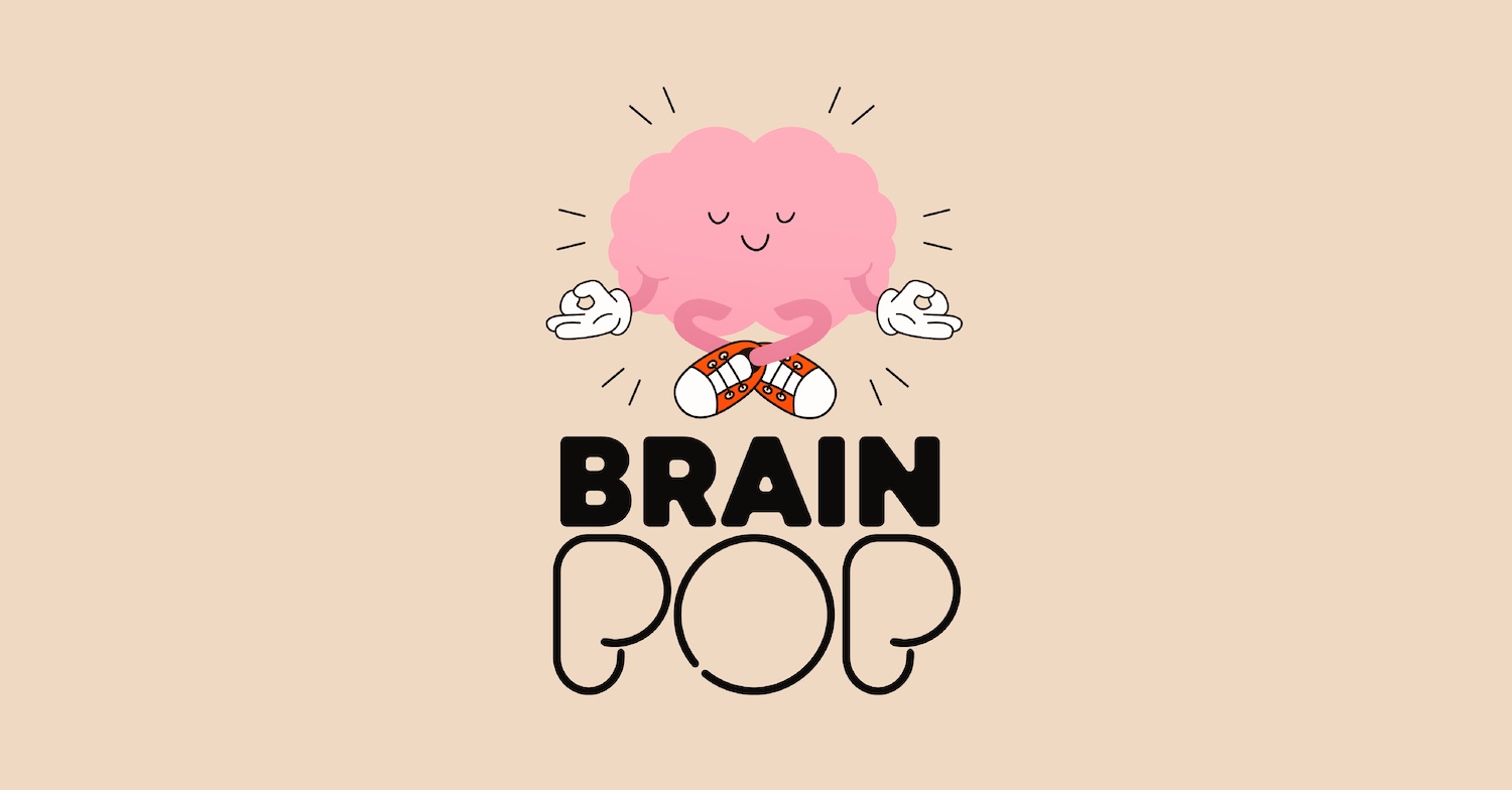
Smart design for a smart drink – giving BrainPOP a look worthy of its name
The Challenge
We first met BrainPOP at the Fancy Food Show, and their name stopped us in our tracks – bold, memorable, and full of promise. Their story was even stronger: founder Sierra created the beverage after a traumatic brain injury, determined to support long-term cognitive health.
But the packaging wasn’t doing the product justice. It looked like another energy drink, blending into a crowded shelf instead of standing apart as a cognitive wellness brand.
BrainPOP needed a visual identity that could compete – and truly communicate what makes it different.
Our Approach: Concept-to-Commerce™ Methodology
We reset the strategic foundation and brought BrainPOP through our Concept-to-Commerce™ (C2C) methodology – a process that turns insight into commercial impact.
Our strategy combined creativity with commercial intelligence. We:
- Mapped competitors and identified clear whitespace
- Explored brand narratives rooted in long-term cognitive wellness
- Stress-tested ideas for shelf impact and future flavor expansion
- Built flexible concepts that could scale with the brand
The Insight
A deep dive into the functional beverage space revealed one defining truth: energy drinks promise a quick jolt. BrainPOP delivers sustained brain support. BrainPOP isn’t chasing a temporary buzz; it’s a cognitive wellness drink with real functional benefits.
That distinction became the North Star for the redesign.
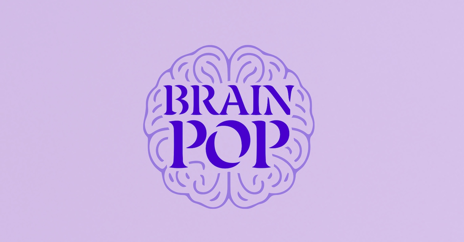
The Solution
The design system needed to express clarity, intelligence, and sustained support – a smarter alternative in a category dominated by impulse energy products.
Unlike agencies that present a single direction, we delivered multiple strategically distinct design routes, each with:
- A defined narrative
- Clear rationale
- Shelf-set validation
- Room to grow
These routes empowered the BrainPOP team to choose the future they wanted – not settle for one idea.
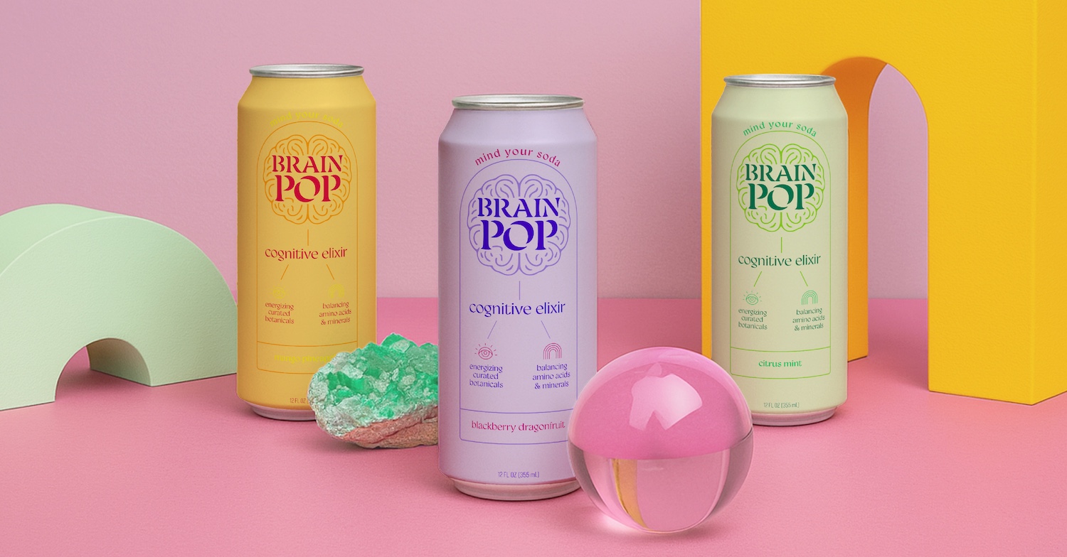
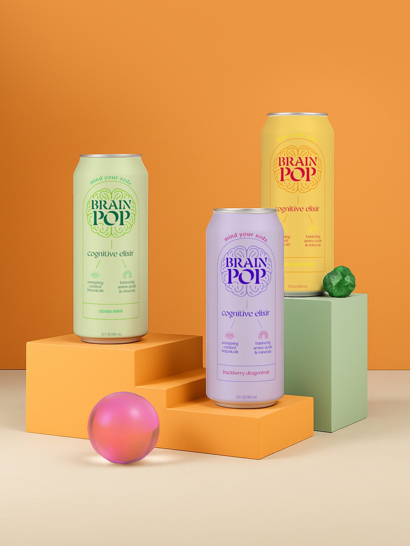
The Result
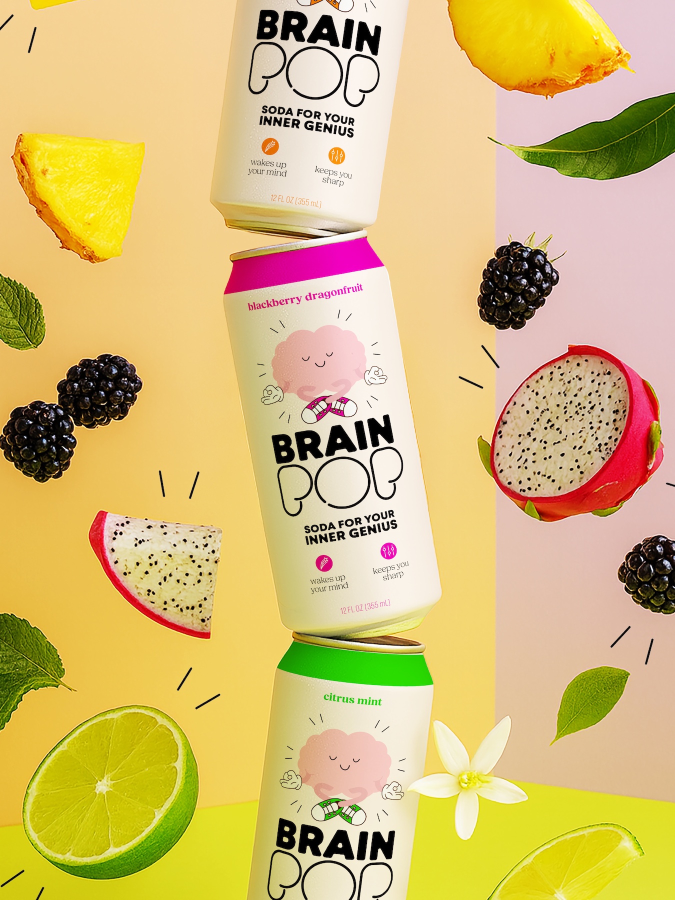
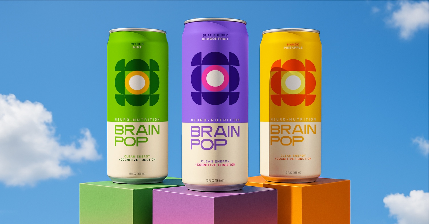
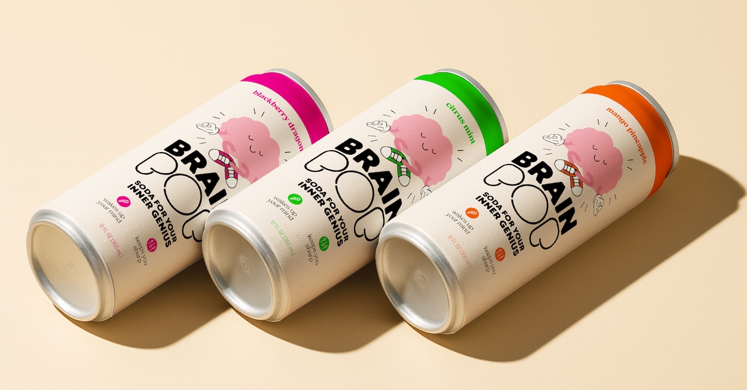
BrainPOP now has three bold, ownable design territories that match its mission and set it apart from traditional energy drinks. Each route offers:
- A future-proof identity
- A commercially viable packaging system
- A strong strategic foundation for mainstream retail
BrainPOP finally looks as smart as the science behind it.
Services Utilized
- Brand Strategy
- Marketplace Audit
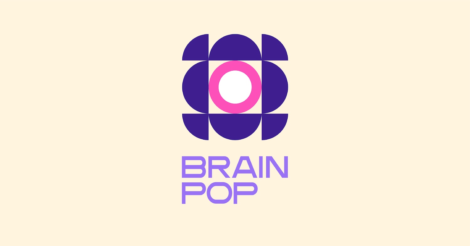
- Visual Identity
- Packaging Design
Smart design for a smart drink – giving BrainPOP a look worthy of its name
The Challenge
We first met BrainPOP at the Fancy Food Show, and their name stopped us in our tracks – bold, memorable, and full of promise. Their story was even stronger: founder Sierra created the beverage after a traumatic brain injury, determined to support long-term cognitive health.
But the packaging wasn’t doing the product justice. It looked like another energy drink, blending into a crowded shelf instead of standing apart as a cognitive wellness brand.
BrainPOP needed a visual identity that could compete – and truly communicate what makes it different.
Our Approach: Concept-to-Commerce™ Methodology
We reset the strategic foundation and brought BrainPOP through our Concept-to-Commerce™ (C2C) methodology – a process that turns insight into commercial impact.
Our strategy combined creativity with commercial intelligence. We:
- Mapped competitors and identified clear whitespace
- Explored brand narratives rooted in long-term cognitive wellness
- Stress-tested ideas for shelf impact and future flavor expansion
- Built flexible concepts that could scale with the brand
The Insight
A deep dive into the functional beverage space revealed one defining truth: energy drinks promise a quick jolt. BrainPOP delivers sustained brain support. BrainPOP isn’t chasing a temporary buzz; it’s a cognitive wellness drink with real functional benefits.
That distinction became the North Star for the redesign.
The Solution
The design system needed to express clarity, intelligence, and sustained support – a smarter alternative in a category dominated by impulse energy products.
Unlike agencies that present a single direction, we delivered multiple strategically distinct design routes, each with:
- A defined narrative
- Clear rationale
- Shelf-set validation
- Room to grow
These routes empowered the BrainPOP team to choose the future they wanted – not settle for one idea.
The Result
BrainPOP now has three bold, ownable design territories that match its mission and set it apart from traditional energy drinks. Each route offers:
- A future-proof identity
- A commercially viable packaging system
- A strong strategic foundation for mainstream retail
BrainPOP finally looks as smart as the science behind it.
Services Utilized
- Brand Strategy
- Marketplace Audit
- Visual Identity
- Packaging Design